- No products in the bag.
…and we are live!
This has been more than a long time coming! It is finally happening!
After months of designing > refining > rethinking > redesigning > developing > redesigning and continuous circles of improvements, the day has finally come. Knowing me, a designer-self-client it could have taken a few more months of additional refinements; I could keep this loop going for years, haha.
Welcome to the new and refined Simply Sleek Designs. This website has been a true labor of love and and I am excited to finally be able to share it with you all. I started this over-haul with a full rebrand in mind in 201?, let’s just say it wasn’t this year or last year. I wanted the visual identity of the brand to reflect the growth of my business over the years. What started off as a hobby helping friends and family brand their businesses and designing for their upcoming events, evolved into a grown up business with no training wheels. The only issue is I was operating as a grown up design shop with a hobby visual identity. A little backwards considering I was offering the service to others and didn’t have my own together don’t you think?
Well, in-between making my clients’ dreams come true, full time work and squeezing in sleep, I was able to get my act together and produce a brand identity that speaks to the quality and caliber of work I actually produce. Yay me!
Without further ado here is the new and improved Simply Sleek Designs —
Moodboard: Research and discovery led to this moodboard and keywords that drove the direction for the final look and feel for the brand.

photos courtesy of Pinterest
Brand colors: Drawing from the the vibes of the curated photos of the moodboard and the keywords that were derived, a fresh, timeless color palette was developed.
![]()
Logo: After many many iterations of different styles and intricate sketches of logos, a rough sketch on a sticky one day in a work meeting was exactly what the brand needed. An easily recognizable symbol that represents form, and positive and negative space ratios. It is elegant simplicity, and it came at the most unexpected time. The typography was a Didone font with its precise characteristics of intense contrast between the thin and thick strokes. Since it’s early creation 1800s, Didone fonts have been key to portraying high-end, sleek and elegant characteristics, all of which are characteristics of the Simply Sleek Designs brand identity. Paired with a simple san serif font for the word “DESIGNS”, the two came together seamlessly.

Website Design: The site is a combination of 2 streams of work — Graphic Design and Invitations + Event Stationery. Under each tab is a full scope of what that stream of work entails and then there are the general pages that apply to both such as the info tab, the shop (coming soon), blog and the contact page. I have to give the most major-est shout out to the most patient, amazing, and detail oriented developer in life. Amanda you’re truly a gem! THANK YOU!
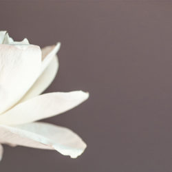
Anyway enough of me talking about it, you’re on the site now so click around and check out the design in it’s full experience. Be sure to check out the new items in the portfolio including ready-to-order invitation suites and details of projects from the graphic design section. I’ve shared sneak peaks on Instagram but you can get the full scoop here. Here are some images to get you started—
 Ok, enough rambling. Hope you enjoy the experience. Stick around a while 🙂
SaveSave
SaveSave
SaveSave
SaveSave
SaveSave
SaveSave
SaveSave
SaveSave
SaveSave
SaveSave
 …the tale of FLOWERLY
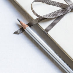 I made you something! Hope it brightens your day!